Art & Design Portfolio
Art and design have always been how I express ideas that are hard to put into words. I love experimenting with form, color, and texture — whether it’s creating moodboards, sketching product concepts, or exploring interior and fashion design. Over the past few years, I’ve built a collection of projects from my summer programs at Auburn, SCAD, Parsons, and Oxford Academia, as well as from my internship at Joe Caprio & Co Real Estate.
Each project taught me something different — how to bring a design from concept to prototype, how to balance creativity with function, and how small choices can completely change the feeling of a space or object. I’ve also included some of my personal artwork and sketches that show how I experiment with new materials and styles.
This portfolio reflects how I see design: as a way to make everyday life more thoughtful, beautiful, and cheerful.
STILL LIFE
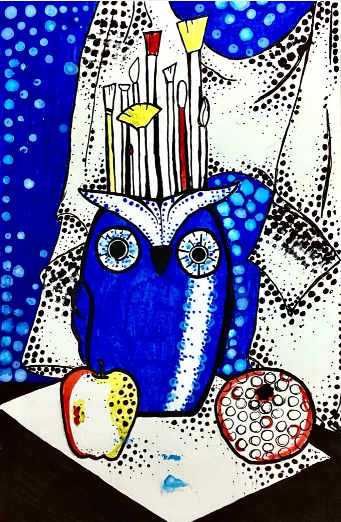
Materials: HB Pencil, Markers, Sharpie, Acrylic Paint
Art Focus: Line, Shape/Form, Value, Benday Dots, Color
Design Principle: Emphasis using a primary color
I began this piece by sketching the still life in pencil and outlining it with a sharpie to create clear, graphic lines. I chose blue as my main primary color and used it to emphasize the central forms. I added areas of flat color and Benday dot patterns inspired by Roy Lichtenstein’s pop art style.
While I enjoyed exploring a more graphic and bold approach, I discovered that my personal style leans toward more realistic still lifes where I can work with shading and detail. One challenge in this piece was that the blue became darker than I expected. Even so, this work helped me understand how color emphasis can change the focus and mood of a composition.
INTERIOR SPACE STUDIO
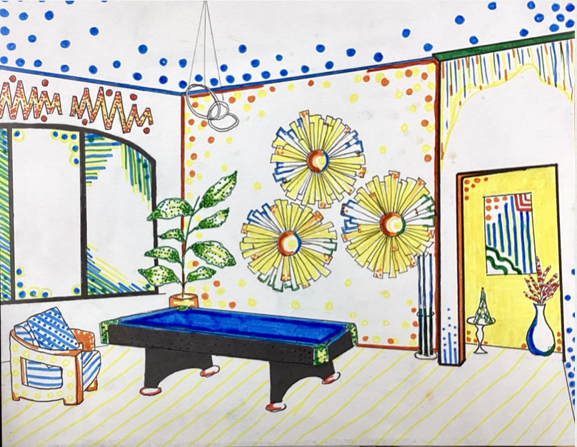
Materials: HB Pencil, Sharpie, Markers
Art Focus: Line, Shape/Form, Value, Benday Dots, Space, Limited Color Palette
Design Principles: Emphasis on Primary/Secondary Color, Space, and Pattern
For this piece, I chose to draw my living room because it is my favorite space in my home. I began with a rule-of-thirds grid, sketched the composition in pencil, and then outlined the forms with a sharpie. I used a limited color palette and added Benday dots to show value and texture, taking inspiration from Roy Lichtenstein’s bold lines and focused color choices.
My biggest challenge was getting the proportions of the room correct, especially the pool table. I am most proud of how the plants, chairs, and decor details turned out. This piece helped me practice organizing space on the page while keeping a strong visual emphasis through color and pattern.
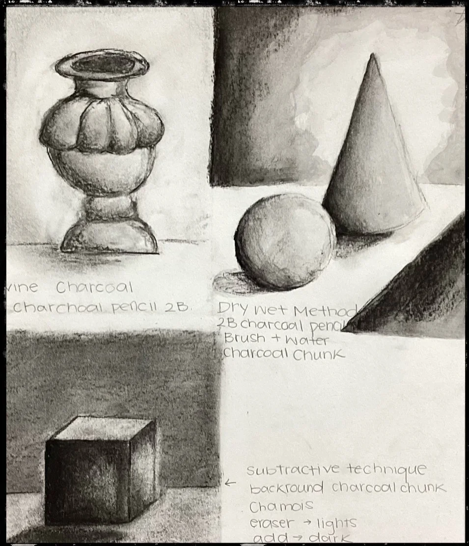
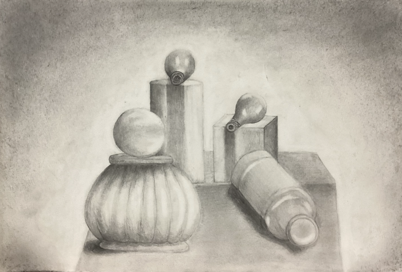
STILL LIFE
Materials: Vine Charcoal, Charcoal Pencils, Charcoal Chunk
Techniques: Dry Blending, Wet, Subtractive
Art Focus: Shape, Form, Value, Texture, Space
Design Principle: Contrast
For this piece, I used vine charcoal to sketch the still life and then went back in with charcoal pencils to define the forms and add detail. I blended the charcoal with a chamois to create soft transitions and stronger value contrast. The most challenging part was keeping the proportions accurate and making the objects appear three-dimensional. I am especially proud of the bottle and flower pot, and how their shading and shapes came together to create depth.

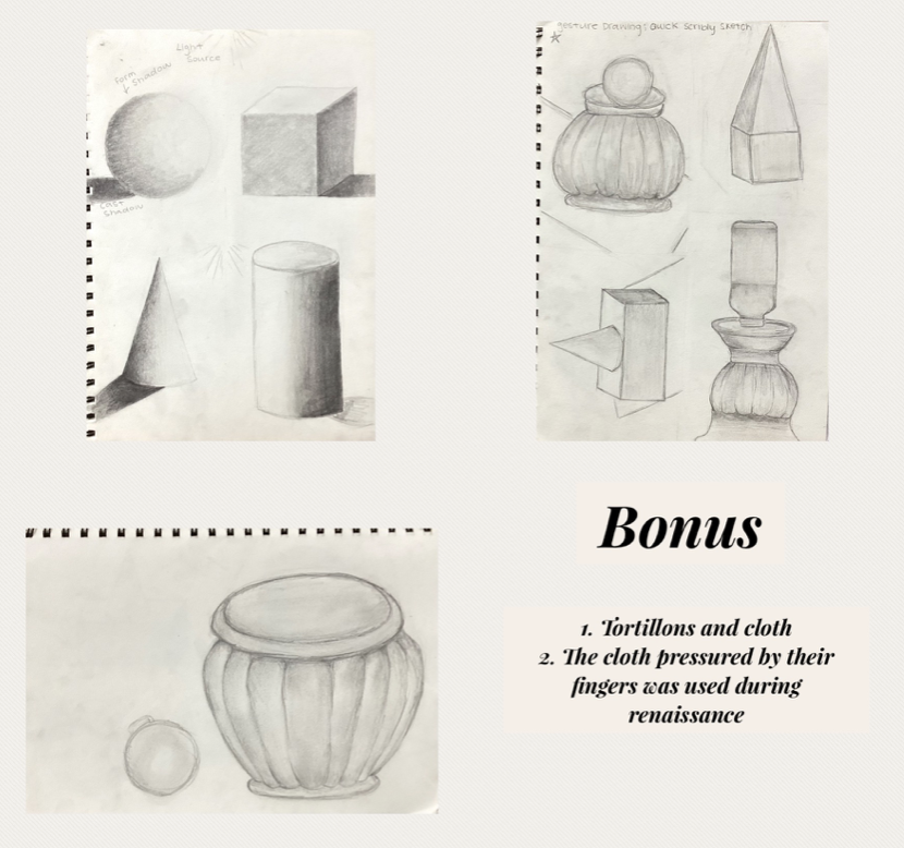
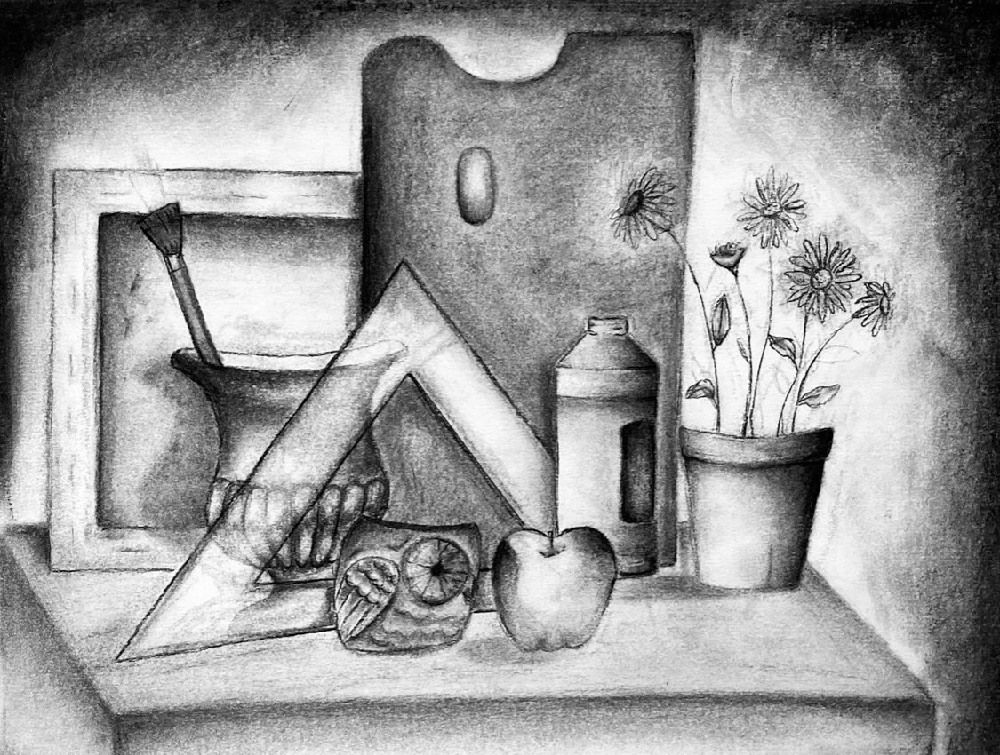
ILLUMINATED SERIES
Materials: HB, 2B, and 6B Graphite Pencils; Chamois; Tortillon
Art Focus: Line, Shape, Form, Value
Design Principle: Balance (Symmetrical and Asymmetrical)
For this still life, I focused on creating strong value contrasts to show form. My lightest value is in the lightbulb, and my darkest value is in the shadow of the bottle. The composition has symmetrical balance, which helps create a calm and steady feeling. I used the tortillon as my preferred blending tool to smooth transitions and create soft shading. The vignette helps unify the entire drawing. My biggest challenge was getting the shape of the bottle correct, but my favorite part of the piece is the bowl because of how the shading and form came together.
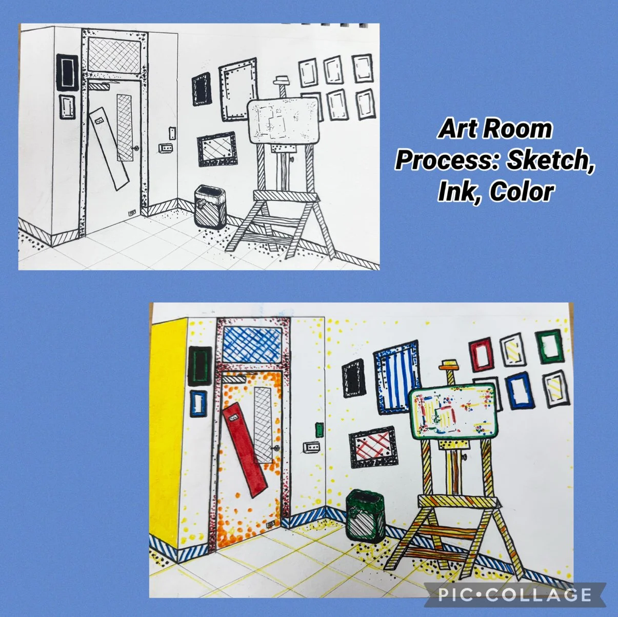
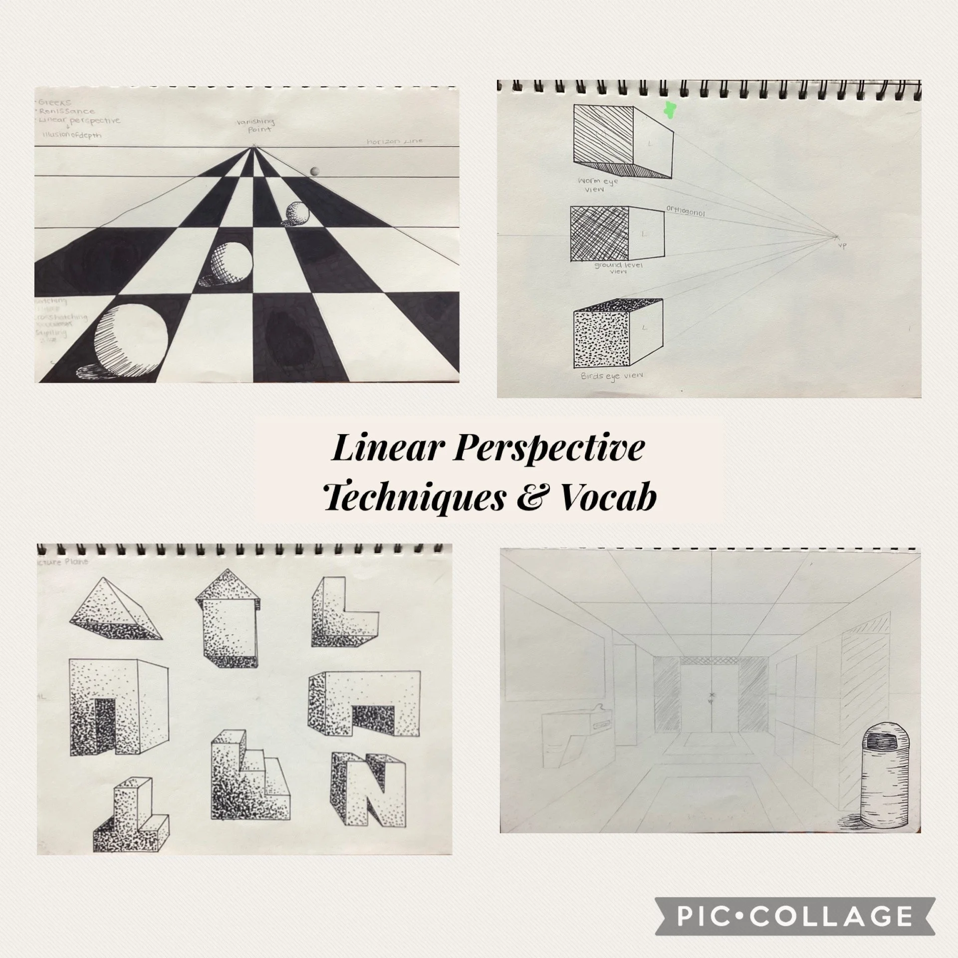
400s HALLWAY
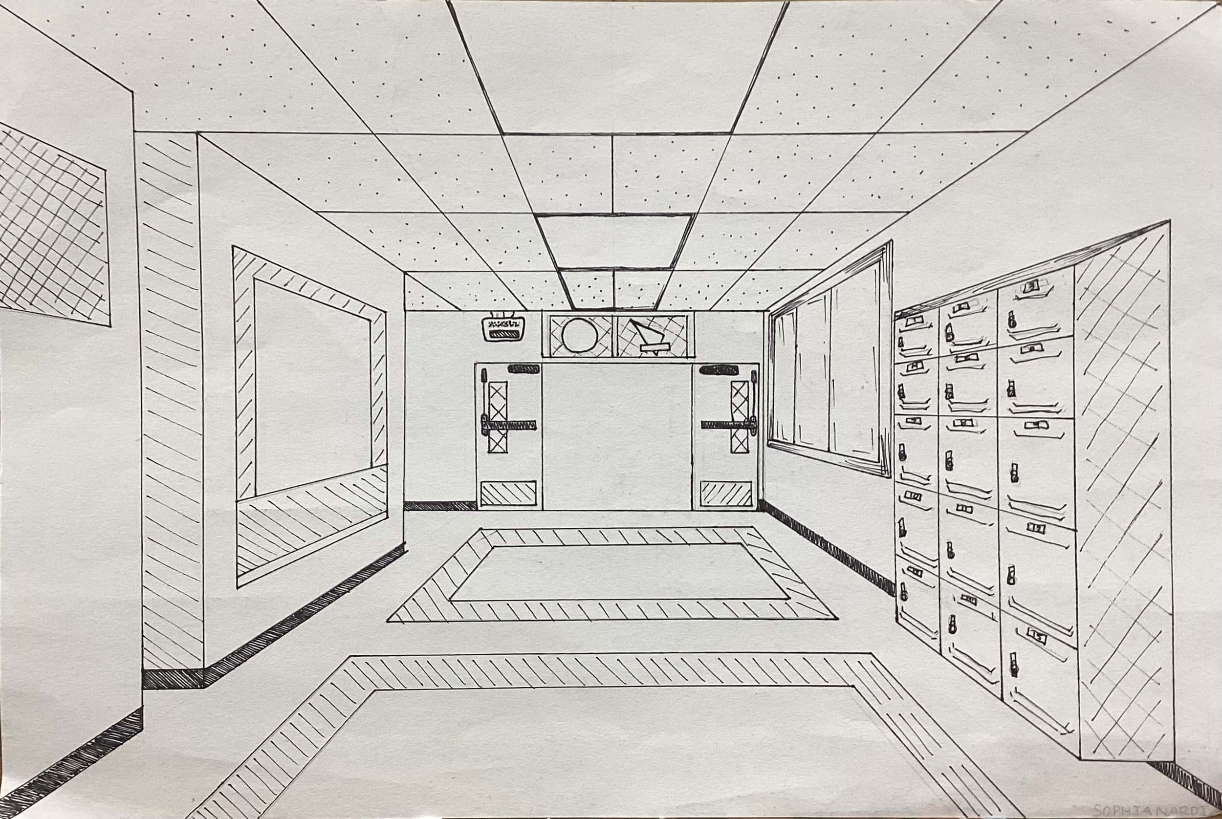
Materials: HB Pencil, T-Square, Micron Pen
Art Focus: Shape, Form, Value, Space
Design Principle: Emphasis on Space
For this piece, I used linear perspective to create the illusion of depth. This technique has been used by artists since the Renaissance, including in Leonardo da Vinci’s The Last Supper, where the vanishing point draws the viewer into the scene. I applied the same idea when drawing the 400s hallway, using a vanishing point to guide all lines and create an open sense of space.
My biggest challenge was drawing the floor in accurate perspective, but I am proud of how the doors and overall structure came out. This artwork helped me understand how space and perspective can make a drawing feel real.
LANDSCAPE OASIS
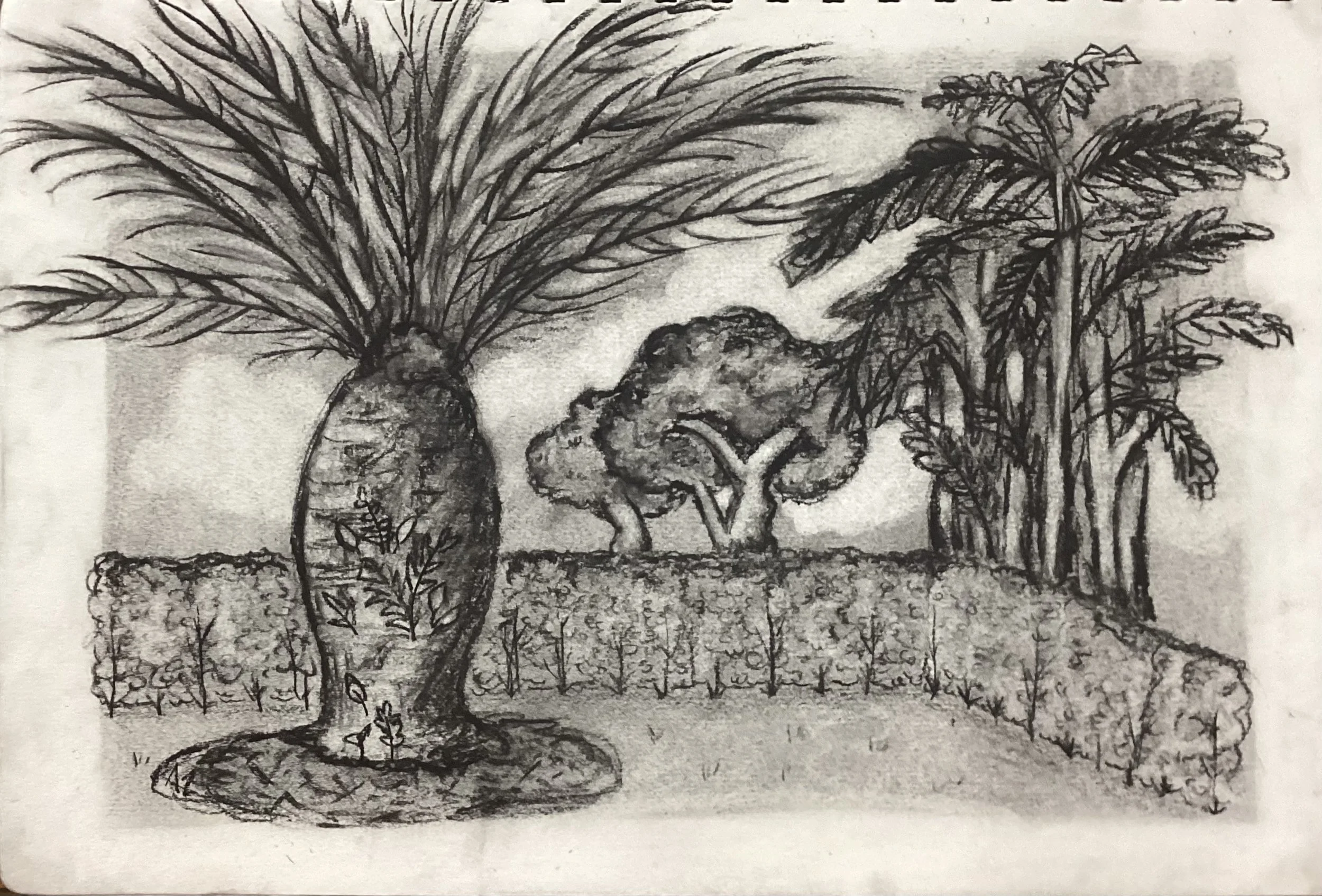
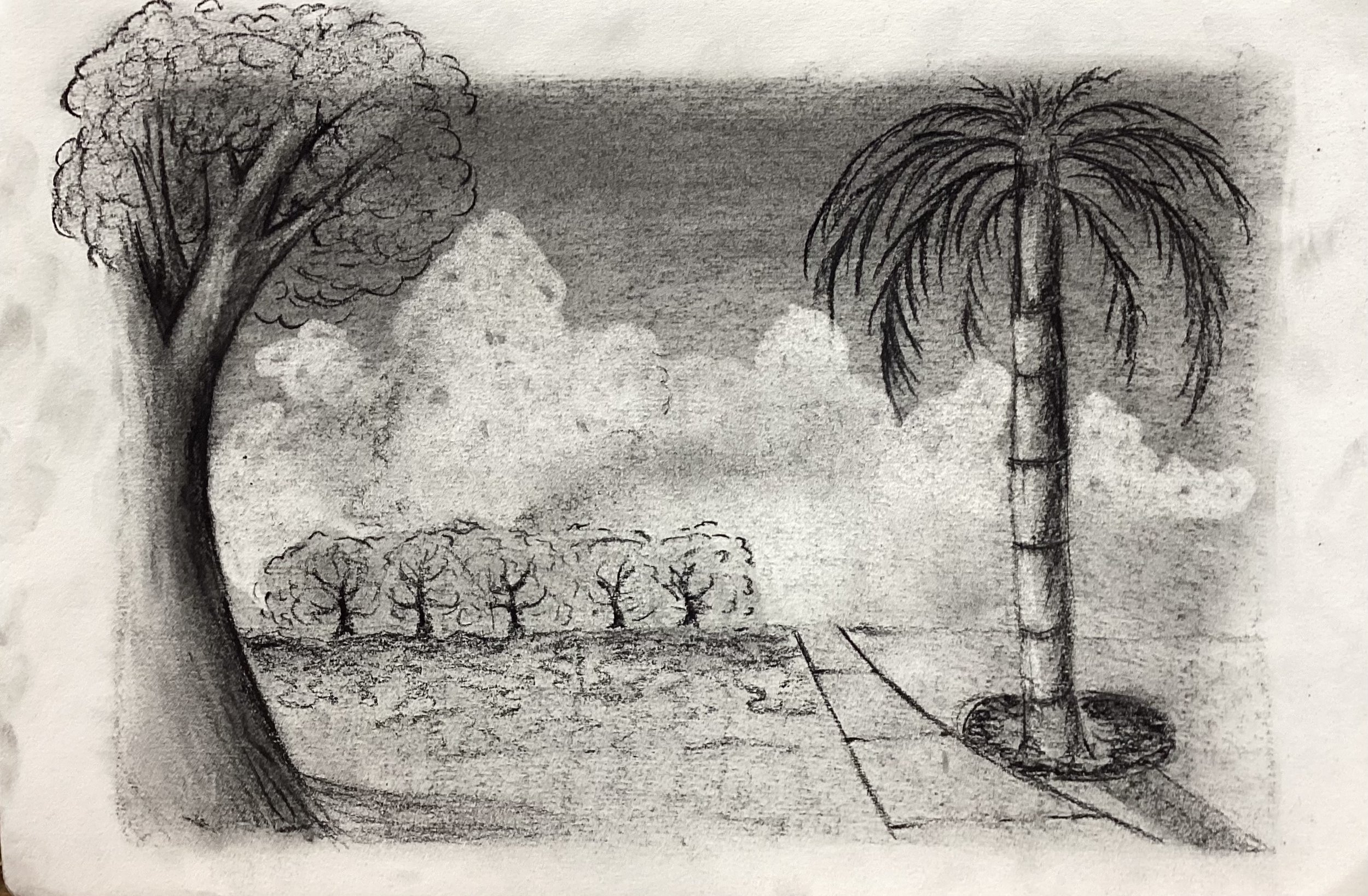
Materials: Charcoal Stick, Charcoal Pencil
Art Focus: Line, Shape, Form, Value, Open Space
Design Principles: Emphasis on Open Space, Contrast, Balance
For these landscape drawings, I focused on capturing the open feeling of the courtyard. I created depth through shading and used squiggly and “w” shaped marks to show the texture of leaves and grass. I first shaded the paper with a charcoal stick, then used the subtractive method by lifting highlights with an eraser. This helped define the light and form in the scene. I feel I was especially successful in rendering the bushes and showing how they sit in the space of the landscape.
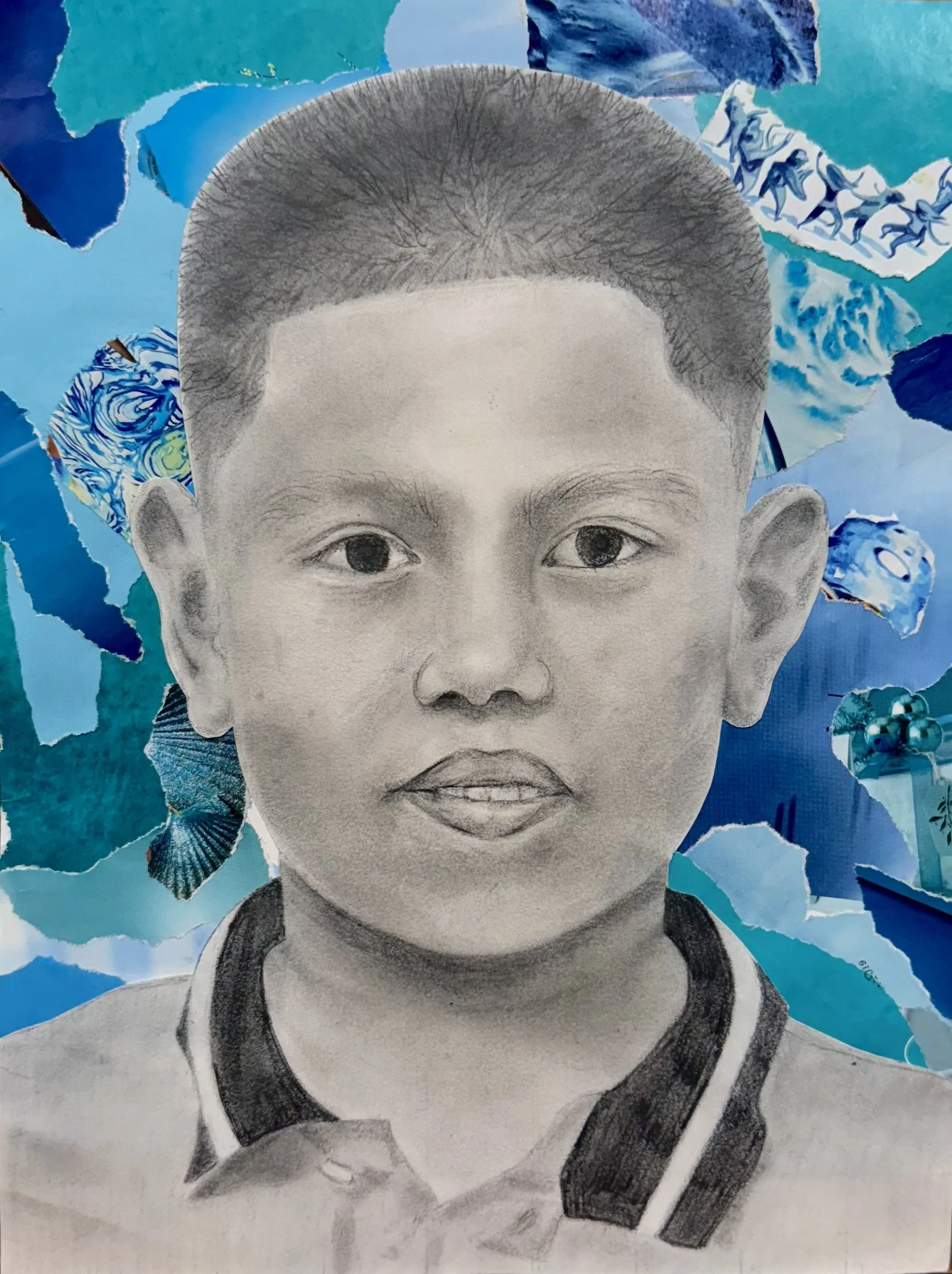
FIGURE DRAWING COLLAGE
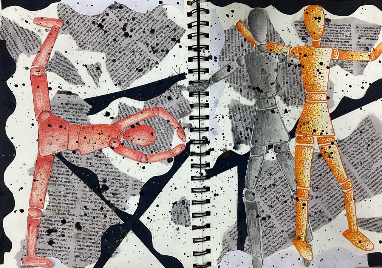
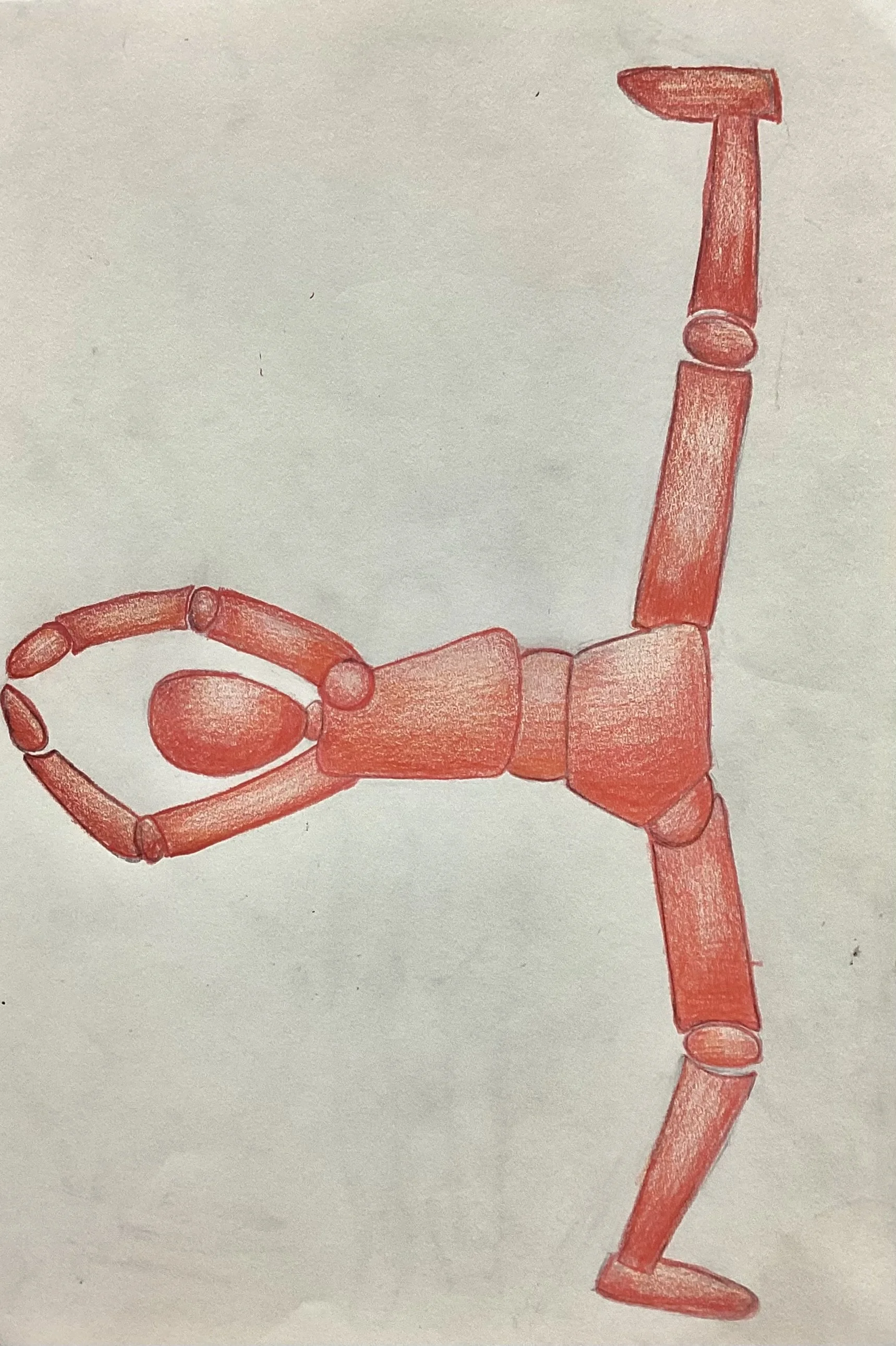
Materials: Mixed Media Collage
Art Focus: Line, Shape, Form, Value, Color (including Tertiary Colors), Negative Space
Design Principles: Unity through Color, Space, and Media; Proportion
In this collage, I explored how different materials and colors can work together to create a unified composition. I learned about Pablo Picasso, who invented collage and was inspired by layered posters on walls. I also studied proportion by using the head as a unit of measurement, a method linked to Leonardo da Vinci. I created tertiary colors such as red-orange and yellow-orange on the figures and used colored pencil blending to add depth and shading.
My biggest challenge was arranging the background papers in a way that felt balanced. My favorite part of the process was blending the colored pencils to create smooth transitions and a cohesive look across the forms.
BEAR PRINT
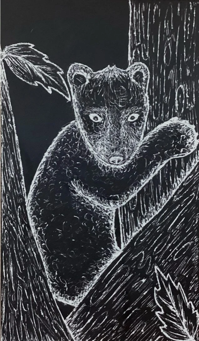
Materials: Rubber Printing Plate, Carving Tools, Brayer
Art Focus: Texture (Emphasis), Line, Shape
For this project, I learned about the history of printmaking, which was first developed in China to create multiple copies of images easily. I also studied the work of Hiroshige, who made woodblock prints of Japanese landscapes. I carved my design into a rubber printing plate, removing areas to create highlights and using different carving tools to build texture. After inking the plate with a brayer, I printed the image and then signed it in red, a color associated with good luck in Chinese culture.
My biggest challenge was planning and drawing the design, but my favorite part was the carving and scratching process. This project helped me understand how texture can shape the mood and character of a print.